For years, I’ve been thinking about a rainbow quilt. I’d really like to do something with a colour wheel. But I’ve not gone for it yet. Some of what I see is over simple. Some ideas are too loud. I know I need to be careful with this idea, so all I do is research. Because research is what you are doing when you are not doing anything else.
I have a difficult place in the mill where I live. Over the modern stairs in the 1798 mill tower, there is a piece of wall. I have the black and white print of a windmill in Norfolk, given to us when we left our last choir, on the white wall where the light shines so you can see it. I really like it there, but a few steps down, there is another wall, in the shade. Often when I am going down the stairs I look at that space and think “Oh no, where is the picture?”
So I know I need something in that space. Recently, I bought a framed sketch from an artist in Hull. I thought it would fit in that space nicely, but when I got it home, the lighting in the space wasn’t up to the job. The sketch deserves more light, and I need something brighter to put on that bit of wall, in the shade. You can see the problem in the last set of pictures in this post.
Then, when I went to the Festival of Quilts I saw just what I needed. Normally, when I see a kit, it is nearly what I want, but not quite. So I was a bit miffed when for once I saw just what I wanted, but the instructions on sale were for the technique, not the actual item. So while I was there, I bought a pack of rainbow charm squares, so I could launch straight into making my hanging. It has taken a while to decide what I wanted to do with the really flexible instructions supplied by Louise Mabbs, who seems to have two websites.
As usual, I was surprised that although I like the range of colours overall, some of them I don’t like at all. I wasn’t surprised that if you take out the colours I don’t like, the result is dull.


The pack I bought has 41 squares. The instructions say you create each unit by sewing two contrasting squares together. So of course there was a brief temptation to go online and buy another pack, but that would make it too big to fit in the space on the wall. I’ll keep that idea for later.
First, I laid the colours out in order, thinking they would “join up” into a circle. I can’t help thinking the last browny red isn’t quite right. It doesn’t flow back into the other end of the rainbow.
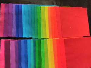
Anyway, the first thing I tried was splitting the colours into two lines, Every other square in a line, taking out that brown.
Colours look different, but when you look at the two separately, you have 2 decent “rainbow” series. At this point, I nearly paired the squares up in this order, so the sides almost matched. Then I decided that I needed more contrast.

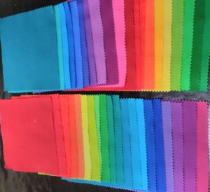
My first thought was to turn one of the 2 sets round. However, I wasn’t sure there would be enough contrast in the middle of the run. I wanted contrast all the way through. If I had played with the technique first, I might have had a better idea of how the contrasts work, and been more confident to go for it. But I wasn’t going to experiment first, so it wasn’t worth the risk.
I needed another idea.
As the greatest contrast is on the opposite side of the colour wheel, and as there were 20 squares per pile, I started one pile with 1st and the other with 11th.
That looked much more promising. So I made a start. In some of the pictures, you can see the pins I used to mark the order of the colours, before I had a firmer system.
This technique involves sewing two squares together, turning them right side out, folding them like an origami windmill and stitching them through the middle of the folds, as creased fabric doesn’t hold its shape like paper. Following the instructions carefully, I marked the front of each piece with chalk. I’m glad I took the precaution of pinning them to a scrap of calico with safety pins, so I didn’t get muddled, because after I’d folded the windmills I couldn’t see the number any more.
Here is a gallery of the process:


I must say, I can see why it is better to sell this as a technique than a kit. I suspect that when we buy a kit, most of us expect to end up with something that looks like the picture on the pack. With this technique, there are many points in the process where you can do something ever so slightly different and change your result. That might mean that a lot of us wouldn’t end up with the result we expected. My design evolved as I went, and I had a lot of fun doing this. It is now nearly three months since I saw the “ideal” wall hanging at the NEC, so I can’t remember how close mine is.
I think my fabric wasn’t the most suitable it could have been. The folds I pressed into it came out surprisingly quickly, which meant I had to do more stitches to hold it in place than I would have liked. And because this is a three dimensional piece, the thread seemed to wind round the sticking out sections on every stitch, which was annoying. That aspect was swinging it onto the list of things I’m unlikely to attempt again in a hurry.
But then I did a quick check on the artist’s name, and found her book on Amazon, which has some tempting ideas.


 My experiment with Zazzle has come to an end. It seemed like a good idea, but it hasn’t really worked.
The principle is sensible. I upload a picture, and “place it” on one of their products, and then the article is ready to be purchased by anyone using their shop. They print to order, and despatch it straight to the customer. When they sell one, I get a commission.
But there are various problems:
My experiment with Zazzle has come to an end. It seemed like a good idea, but it hasn’t really worked.
The principle is sensible. I upload a picture, and “place it” on one of their products, and then the article is ready to be purchased by anyone using their shop. They print to order, and despatch it straight to the customer. When they sell one, I get a commission.
But there are various problems:
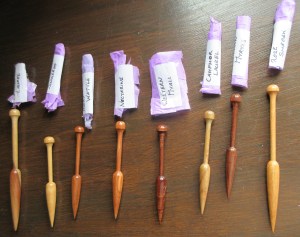
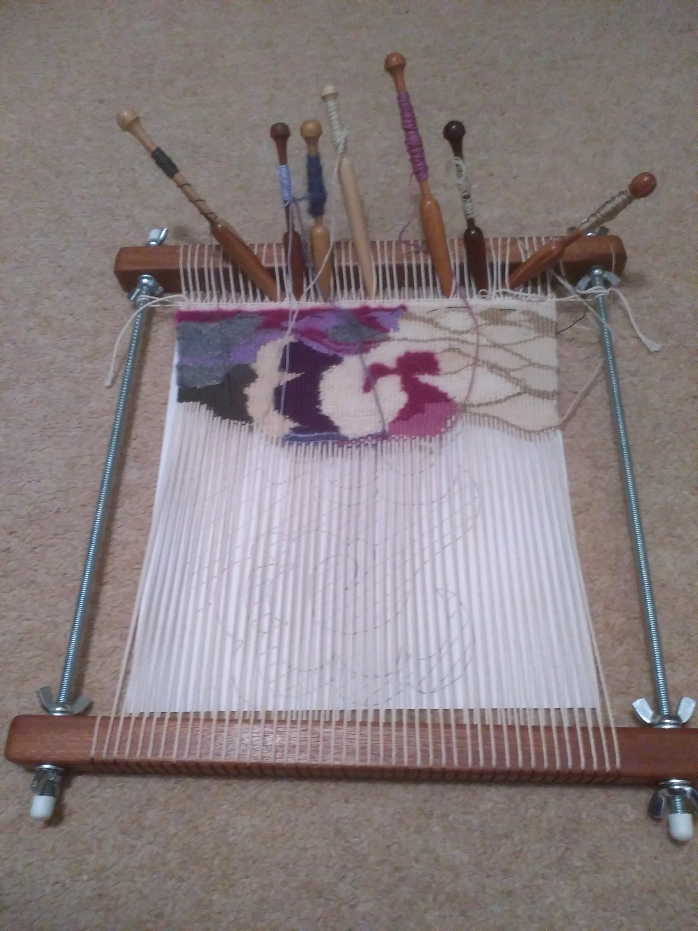 So when I decided I needed more bobbins, I thought I would investigate the nicer ones. As you might expect, they are not that easy to find. You can’t just wander into the local craft shop and pick some up. These came from Australia, as you can probably guess from the names of the woods, like Bungeroo, Tasmanian Myrtle, Hairy Wattle, and Rose Sheoak.
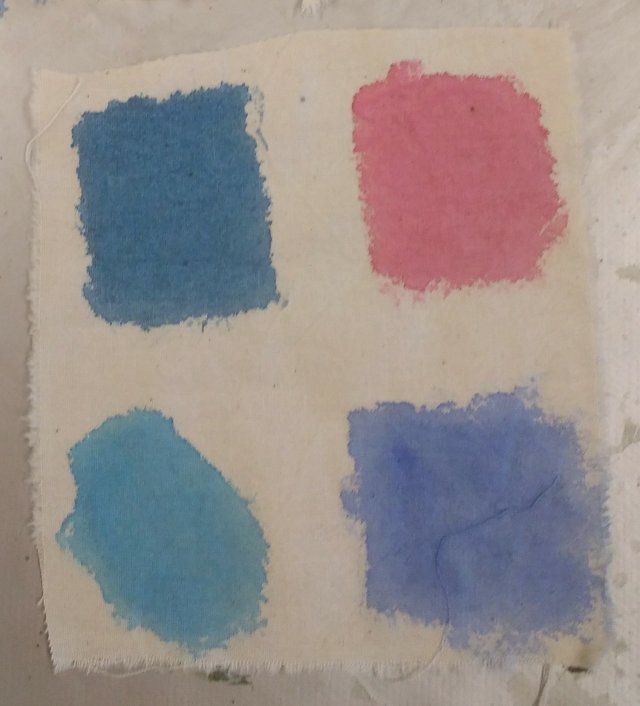 I decided to test a range of colours with different characteristics:
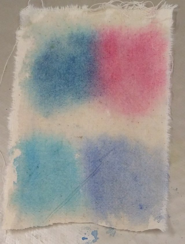 The next step was to paint on damp fabric. The paint I used was the same strength. As you can see:
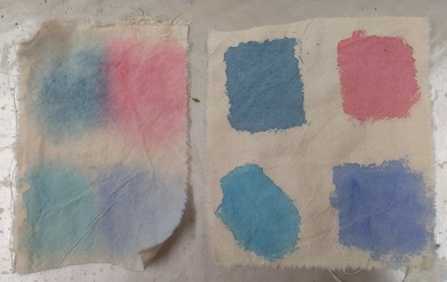 Once the sample was dry, it looked like this. Not quite what I was expecting, but still plenty of potential for textiles.
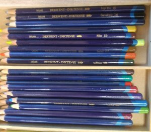 So I moved on to my Inktense pencils. You can get these colours in sticks, but I reckon I’m better off with the protection of some wood round my colour, so I’ve gone for the pencil version.
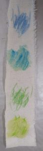 For this experiment, I just scribbled a couple of patches of colour with each pencil. For each colour, the top picture shows the original pencil, and the lower one shows what happens when it is brushed with water.
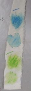 So I rubbed a little gel on the untreated sample of each colour. In the second picture, you can see:
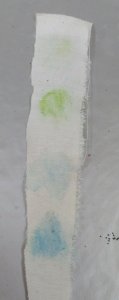 Interestingly, the colour shows more on the back of the sample where the gel has been used than the water.
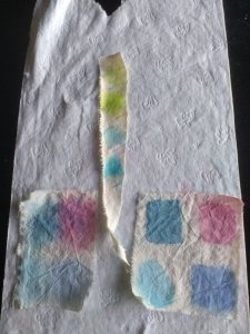 The idea is that if a colour is not wash fast, it will bleed out onto the paper below it.
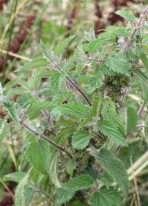 What can you do with nettles?
 When I was little, I had a square of lino, printed with a town map. It kept us occupied for hours, driving dinky cars down the streets, and making up all sorts of stories about what was going on in that town. Then we could roll it up, and prop it up in the corner, out of the way, until next time.